Did you know there are dead giveaways inside a book that shout self-published? While self-publishing is increasingly common, the last thing you want is for your book to look unprofessionally produced. Even if the writing in your book is spectacular, formatting issues can lead to a frustrating, poor reading experience, poor reviews, and eventually hurt future sales.
On the flip side, subtle details make your book ready for front-window bookstore placement. More importantly, those details can enhance your reader's experience, allowing them to fully engage with your writing.
What information should a title page include? Where does the copyright page go? Do you need a half-title page? What belongs in your book's headers? How do you format your Table of Contents? Where should page numbers go? Do all pages need numbers? What order do the front and back matter take? What are front and back matter, anyway? What fonts are best? What size is best? Does the style of your formatting enhance the topic/theme of your writing?
Following publishing industry standards–and knowing when it's okay to creatively break those standards–not only makes your book look great, but it also makes your book read well. Happy readers keep turning the pages, and they read your book cover to cover. Happy readers recommend your book to others. Happy readers will want you to write and publish more books.
If you desire a professional-looking book interior with minimal use of graphics, ready to send to your printer or upload to Amazon, Kindle, etc., I can provide that for you. You can choose a pre-determined template, or I can work with you to create a customized look. I work in the following formats:
Microsoft Word
Apple Pages
InDesign
Print-Ready PDF
Interior formatting for print begins at $350.00; conversion from print format to eBook format begins at $100.00. Both are dependent on the length of the manuscript and the complexity of the design desired.
If your book interior requires complex or unique graphic design, let me know that, too. I've got some great colleagues to refer you to.
Title page samples

Full title page

Full title page
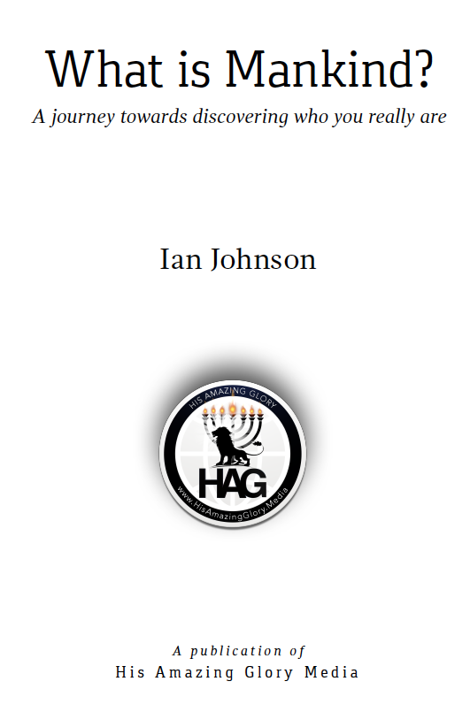
Full title page
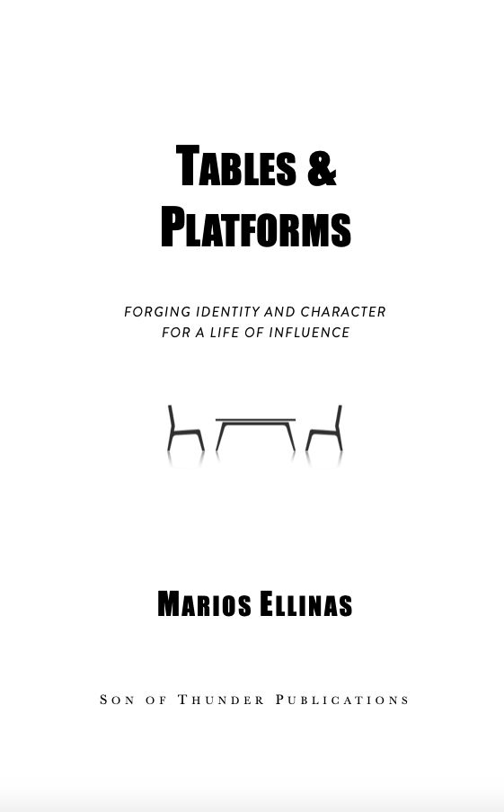
Full title page
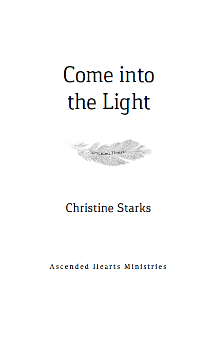
Full title page
Chapter Page Samples
Styled for an academic/contemplative study which was being republished after 30 years. A modern look for a classic book, where serious study meets friendly approach to prayer. From Prayer & Temperament:
Below is a sample from a children's picture book. I originally helped the author edit her manuscript. She had beautiful illustrations done but then needed help reformatting when the illustrator's files were in the incorrect format for uploading for print. It was a challenge, but the interior (and cover) turned out beautifully. From Perfect Penny:
The pages below were styled for a short but complex prophetic, first-person account. The entire manuscript was dialog with some description. To avoid constantly introducing speakers and overusing quotation marks, I found a way to show the appropriate voices without intrusive punctuation or adding awkwardly repetitive tag lines. From The Holy City:
A memoir sample, below. The text was divided into numbered sections and chapters and had an attractive combination of subheads, breaks, and personal photos, all to reflect a unique combination of the writer's international upbringing, cultural identification, focus on meditation, and his career in the medical field. From Raindrops:
Another children's picture book, below: for this one, which is part of a series, the author wanted a classic look. From Rupert Finds a Family:
